Two-Tone to Touchscreens – How an 80s Mod Kid Ended Up Designing Today’s Coolest Minimalist Phone Cases
If you grew up in the early 80s like I did, you’ll know exactly what I mean when I say the two-tone era wasn’t just a fashion moment—it was a whole vibe. Mods, scooters buzzing around town, black-and-white checks, sleek suits, The Specials blasting through tinny speakers… it was a time. And, honestly, it still shapes how I see design today.
Back then, I had my pride and joy: a proper two-tone suit. Black on one side, white on the other, razor-sharp lapels, the lot. I wore it to the local disco with more confidence than sense. Imagine a skinny teenager stepping into a smoky hall with neon lights bouncing off polished shoes and a DJ spinning ska like his life depended on it. That suit made me feel ten feet tall. It didn’t matter that the disco floor was sticky or half the crowd couldn’t tell the difference between two-tone and tartan—I felt like the main character.
It’s funny how those early style influences stick with you. Decades later, living on the other side of the world, designing phone cases of all things, I can still trace so much of my taste back to those Mod days. Clean lines. High contrast. Simple shapes that hit the eye instantly. Two colours doing all the heavy lifting. It’s timeless, really.
How Two-Tone Sneaked Back Into My Creative Life
Fast forward to now. I spend a lot of time creating designs for my little brand, Head Cases Online. From abstract pieces to travel-inspired scenes and the odd whimsical one, I’ve done a bit of everything. But recently, without really planning it, two-tone has crept back in—just in a more modern, minimalistic way.
It started when I was playing around in Canva one day, trying to create something bold but simple. I wasn’t in the mood for anything ornate or overly detailed. I picked two colours, blocked them out, added a bit of texture, and suddenly it hit me: this looks like a grown-up version of the two-tone aesthetic I used to love. Clean. Punchy. No fuss. Straight to the point.
From there, the idea of a whole two-tone series took shape—but with a national twist.
Instead of sticking to the classic black and white, I thought: why not take the colours of different national flags and use those as the two-tone foundation? Minimalist, abstract, and instantly recognisable.
So far, I’ve done Spain, Scotland, and England—and they’ve honestly been some of the easiest and most satisfying designs I’ve made. Thing is, I chose flowers for Scotland and England but there are other iconic things that would have been good too.
Spain, Scotland & England – The First Wave
The Spain one came first. Red and yellow are such loud, confident colours, which makes them perfect for two-tone-style layouts. I blocked each side, softened the transitions just a little, and added a Spanish bull silhouette. The whole thing just works. The colours speak for themselves.
Then came Scotland. Being Scottish myself, I had to get this one right. Blue and white is a slightly calmer palette, but it still pops when you position the colours well. I added the Highland cow—because you can’t get more Scottish than that—and the case came out beautifully minimal while still proudly patriotic.
England was next. Red and white, St George’s Cross colours, and of course I went with the lion. Simple, bold, unmistakably English.
These three ended up forming the start of my ‘National Two-Tone Collection,’ even though I never actually sat down and formally planned a collection. They just happened naturally—much like my two-tone suit choices back in the day.

The Process – Honestly, It’s Stupidly Simple
If you use Canva, you’ll know how easy it is to fall down the rabbit hole. One quick design tweak becomes an hour of rearranging things, trying different textures, bouncing between templates… but this two-tone style cuts all that out.
Here’s literally all I do:
-
Pick the flag colours
Two (or 3) main colours only—that’s the whole point. -
Create a bold split background
Vertical, diagonal, even a slightly skewed block. Anything with strong contrast. -
Add a simple shape or symbol from that country
Nothing over-detailed. Think silhouettes or clean line art. -
Keep it uncluttered
Two-tone only works if you resist the temptation to add “just one more thing.”
The beauty of it is that the designs stay striking without feeling busy. They translate perfectly onto phone cases because the shape of the phone naturally enhances the simplicity—especially with the 3D wrap Printify uses.
France, Norway & Italy – The Next Wave
I’m already moving onto the next three: France, Norway and Italy. Again, they all have powerful colour combos that really lend themselves to this style.
France
Blue, white, and red. Instantly iconic. I’m torn between adding the Eiffel Tower silhouette or a croissant (kidding… mostly). The Eiffel Tower will win, obviously.
Norway
This one’s fun. Red and blue with white accents. I’m leaning toward a minimalist Viking helmet silhouette—clean, no detail, just unmistakably Norwegian.
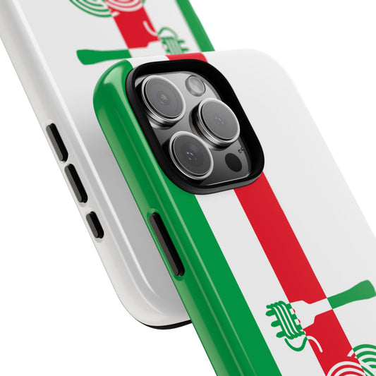
Italy
Green, white, and red. I can already picture it with a leaning tower silhouette, placed just off-centre for that extra bit of flair. Italy’s colours are so easy to work with; they practically design themselves.
Once those three are done, the collection will start looking properly international.
Why Two-Tone Still Works Today
Even though the Mod era is long behind us, the principles of two-tone design haven’t aged at all. In fact, they feel more relevant now than they did back then.
Today’s world is flooded with visual noise—patterns, gradients, high-detail illustrations everywhere you look. Minimalism cuts through all of that. Clean colours. Clear edges. No-nonsense design.
Two-tone is timeless because it’s simple—but simple in a way that feels confident. You don’t hide behind busyness. You let the colours do the talking.
And maybe that’s why this whole project has felt so natural for me. It’s like reconnecting with the teenage version of myself—only now, instead of a suit and a disco floor, I’m working with Canva and sending these designs off to be printed on tough phone cases.
Looking Back – and Looking Forward
It’s wild to think that a style I wore as a kid, in a tiny local disco in Scotland, is inspiring products I’m selling decades later. Funny how the creative mind loops back around to its roots.
I’ve always believed that design should be fun, uncomplicated, and meaningful—even if it’s subtle. And this two-tone national series ticks all those boxes.
If the early 80s taught me anything, it’s that style never really disappears. It just morphs, evolves, and comes back in ways you don’t expect. In the case of my latest designs, it’s come back through the shape of a phone case—something teenage-me could never have imagined.
But I reckon he’d approve. Especially if I wore it with the suit.